> ## Documentation Index
> Fetch the complete documentation index at: https://docs.bluegenai.com/llms.txt
> Use this file to discover all available pages before exploring further.
# Workflow
> Working in Prototype Mode: organising requirements into folders, prompting the agent, and setting the look with the Design System.
## The Workspace
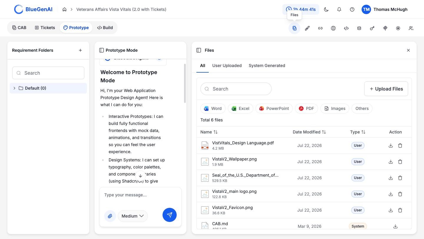
The prototype workspace is compused of Three columns. **Requirement Folders** on the left, the **Conversation** in the middle, and **working panels** you open on the right.
 ## Requirement Folders
**A Requirement Folder groups related requirements and gives them their own conversation.** One folder per capability, per screen, or per process step, whichever matches how your team already talks about the system.
A new project starts with one folder named **Default**, holding nothing. Add folders with the `+` control at the top of the rail, and search them with the field below it.
Folders matter more than they look. Each carries its own conversation thread, so two people can work on separate parts of the same project without landing in each other's chat history. Switching back to Prototype Mode returns you to the folder you were last in.
Organise folders the way you describe the system out loud: by capability (Intake, Case Management, Reporting), by screen (Login, Dashboard, Admin), or by process step (Submit, Review, Approve). Renaming and reorganising later costs nothing.
## Prompting the Agent
The composer sits under the conversation. Alongside the message box are a paperclip for attaching reference material and a quality selector.
**Describe the outcome rather than the interface.** The agent produces better results from "residents apply for a permit and staff review it" than from a description of forms and fields. Say who it is for, what they are trying to do, and any constraints that matter.
Attach anything that shows what you want: a solicitation, a brand guide, screenshots of a system you like. Attachments accept images and documents.
## The Panel Rail
Ten controls sit at the top right, each opening a panel over the third column. In Prototype Mode they are: **Files**, **Design System**, **URLs**, **Preview**, **Codebase**, **Database**, **Credentials**, **MCP Servers**, **Stop App**, and **Manage Collaborators**.
Two matter most while prototyping.
**Files** holds everything in the project, split into `User Uploaded` and `System Generated`. Anything you save from a conversation lands here, and this is where you find it again later.
**Design System** sets the look of everything the agent produces.
## The Design System
## Requirement Folders
**A Requirement Folder groups related requirements and gives them their own conversation.** One folder per capability, per screen, or per process step, whichever matches how your team already talks about the system.
A new project starts with one folder named **Default**, holding nothing. Add folders with the `+` control at the top of the rail, and search them with the field below it.
Folders matter more than they look. Each carries its own conversation thread, so two people can work on separate parts of the same project without landing in each other's chat history. Switching back to Prototype Mode returns you to the folder you were last in.
Organise folders the way you describe the system out loud: by capability (Intake, Case Management, Reporting), by screen (Login, Dashboard, Admin), or by process step (Submit, Review, Approve). Renaming and reorganising later costs nothing.
## Prompting the Agent
The composer sits under the conversation. Alongside the message box are a paperclip for attaching reference material and a quality selector.
**Describe the outcome rather than the interface.** The agent produces better results from "residents apply for a permit and staff review it" than from a description of forms and fields. Say who it is for, what they are trying to do, and any constraints that matter.
Attach anything that shows what you want: a solicitation, a brand guide, screenshots of a system you like. Attachments accept images and documents.
## The Panel Rail
Ten controls sit at the top right, each opening a panel over the third column. In Prototype Mode they are: **Files**, **Design System**, **URLs**, **Preview**, **Codebase**, **Database**, **Credentials**, **MCP Servers**, **Stop App**, and **Manage Collaborators**.
Two matter most while prototyping.
**Files** holds everything in the project, split into `User Uploaded` and `System Generated`. Anything you save from a conversation lands here, and this is where you find it again later.
**Design System** sets the look of everything the agent produces.
## The Design System
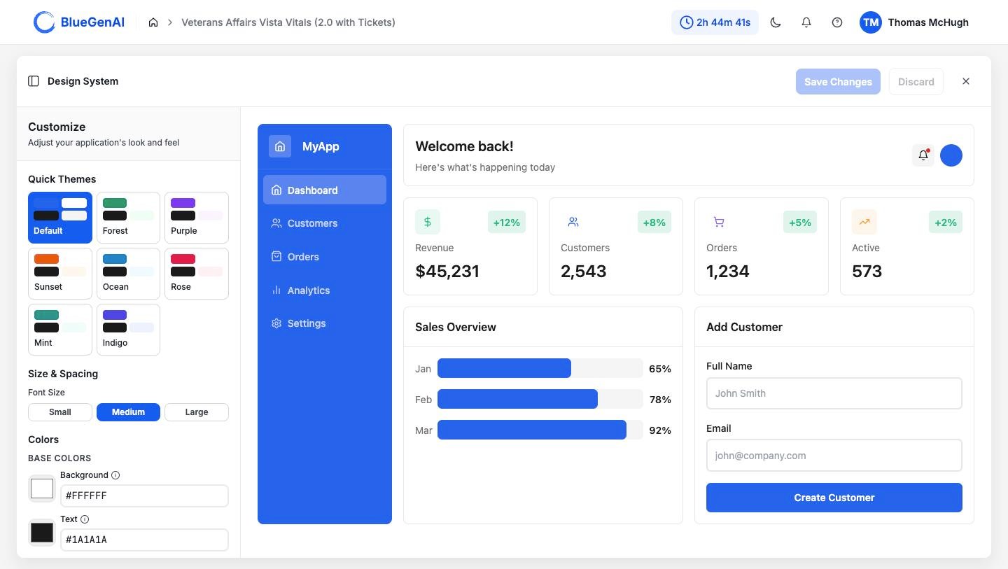 Eight named themes give you a starting point: `Default`, `Forest`, `Purple`, `Sunset`, `Ocean`, `Rose`, `Mint`, and `Indigo`. From there you can set font size, font family, corner roundness, and every colour the interface uses, grouped into base colours, buttons and actions, and form fields.
The preview beside the controls is a working sample application. It re-renders as you change settings, so you see the effect before applying it. Changes are held until you select **Save Changes**, and **Discard** returns them.
Settling this early is worth the time. Everything the agent builds afterwards inherits it.
## Your Next Step
When the prototype is close enough to build from, the next question is what carries forward.
What moves between modes, and what you have to take with you.
What it produces, and what it deliberately leaves out.
## Related topics
- [Workflow](/web-apps/build-mode/workflow.md)
Eight named themes give you a starting point: `Default`, `Forest`, `Purple`, `Sunset`, `Ocean`, `Rose`, `Mint`, and `Indigo`. From there you can set font size, font family, corner roundness, and every colour the interface uses, grouped into base colours, buttons and actions, and form fields.
The preview beside the controls is a working sample application. It re-renders as you change settings, so you see the effect before applying it. Changes are held until you select **Save Changes**, and **Discard** returns them.
Settling this early is worth the time. Everything the agent builds afterwards inherits it.
## Your Next Step
When the prototype is close enough to build from, the next question is what carries forward.
What moves between modes, and what you have to take with you.
What it produces, and what it deliberately leaves out.
## Related topics
- [Workflow](/web-apps/build-mode/workflow.md)